Kali
Redesigning how patients monitor their potassium, across a handheld device, an app and the NHS pathway around them.
Overview
People who need their potassium checked often wait days for a result: they travel to a clinic for a blood test, then hear back once the reading is already out of date. Kali lets them test at home in under a minute, understand what the result means, and share it with their clinician automatically.
I developed Kali with clinicians at Guy’s and St Thomas’ and Cambridge medtech company Kalium Health. It’s one system in three parts, each designed to work with the others.
- Research
- 10 interviews with clinicians, nurses, patients and families
- Clinical input
- Developed and tested with clinicians at Guy’s and St Thomas’
- Usability
- Evaluated with 5 people at Evelina London Children’s Hospital
- Recognition
- New Designers of the Year Award Winner, 2024
The problem
More than 850 million people worldwide live with kidney disease,1 and around 1 in 5 people with end-stage kidney disease have high potassium.2 Potassium that’s too high or too low can be dangerous, so many patients need regular checks.
Today, those checks are slow and hard to fit around life.
- In-person only
- Tests happen at a clinic or GP, so results are often out of date by the time they arrive.
- Guesswork between tests
- Patients and families don’t know their current level, or what to do about it.
- Hard to fit around life
- Travelling to tests while unwell, then waiting days for results, takes a toll on physical and mental health.
- Disconnected systems
- Hospitals and GPs use different IT systems, so results are slow to reach the right clinician.
How testing works today
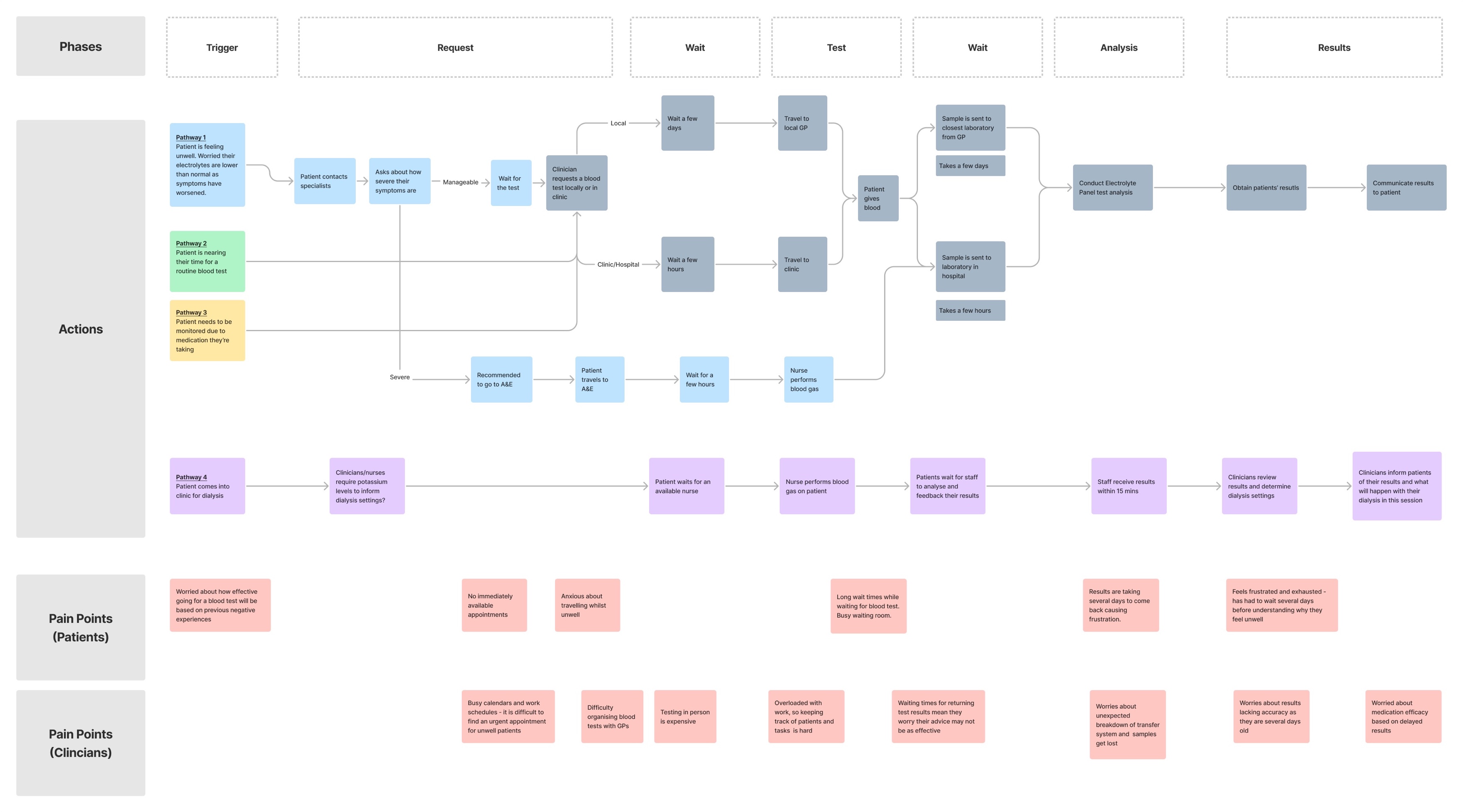
I ran ten semi-structured interviews with clinicians, nurses, patients and their families at Guy’s and St Thomas’ and Evelina London Children’s Hospital, then mapped the existing testing pathways from end to end.
The research had ethics approval from Brunel. A thematic analysis of the interviews surfaced four themes: patients struggling to stick to treatment plans, the logistics of getting tested, poor communication between hospitals and GPs, and how often different patients need testing.
“I don’t know what the level is. And she doesn’t know. So it’s kind of a guessing game.”
The map shows four common ways into a test. Every one involves travelling, waiting and chasing results, with delays of hours to days at several stages.
What patients told me
- There are no appointments available straight away.
- Travelling while unwell is stressful.
- Waiting rooms are busy and the waits are long.
- Results take several days to come back.
- It can take days to understand why they feel unwell.
What clinicians told me
- It’s hard to find urgent appointments for unwell patients.
- Organising blood tests with GPs is difficult, and testing in person is expensive.
- Samples can get lost in transfer between sites.
- By the time results arrive they may no longer be accurate.
- Delayed results make it harder to judge whether medication is working.
The redesigned pathway
With Kali, every patient group follows the same simple pathway: test at home, get an instant result, and act on clear advice.
Every result is sent to the clinician automatically, and the next steps appear in the app. Compare it with the pathway today.
The device
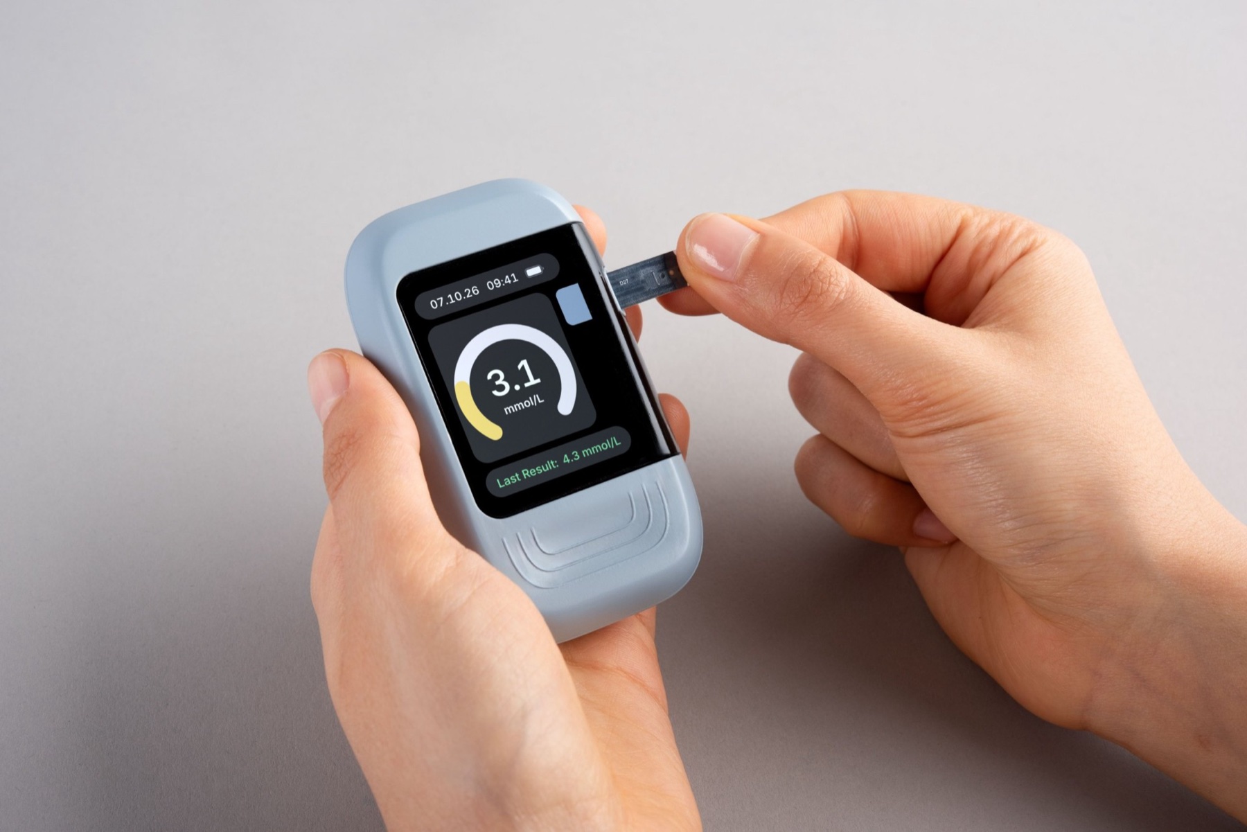
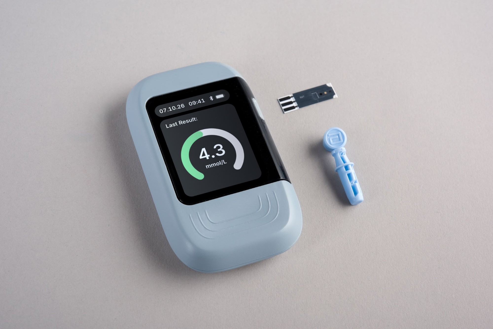
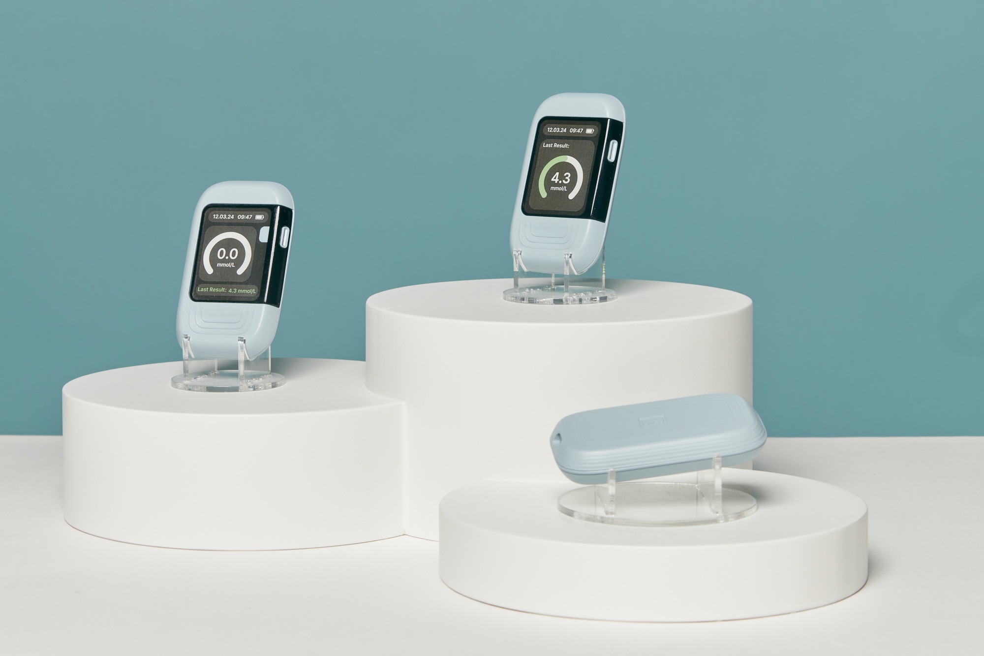
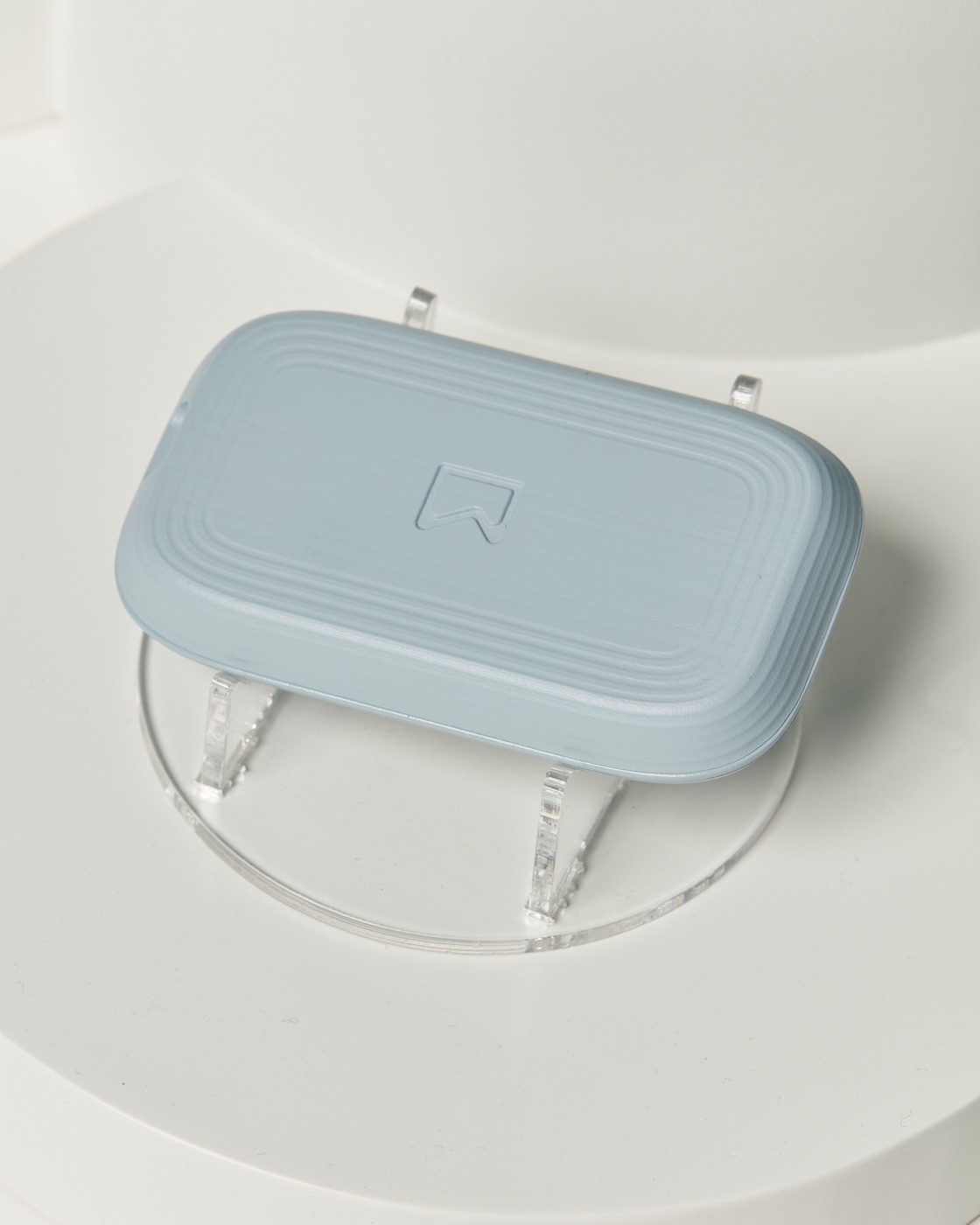
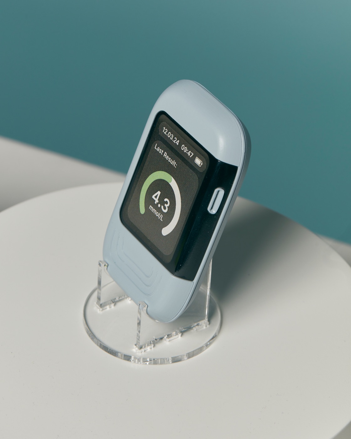
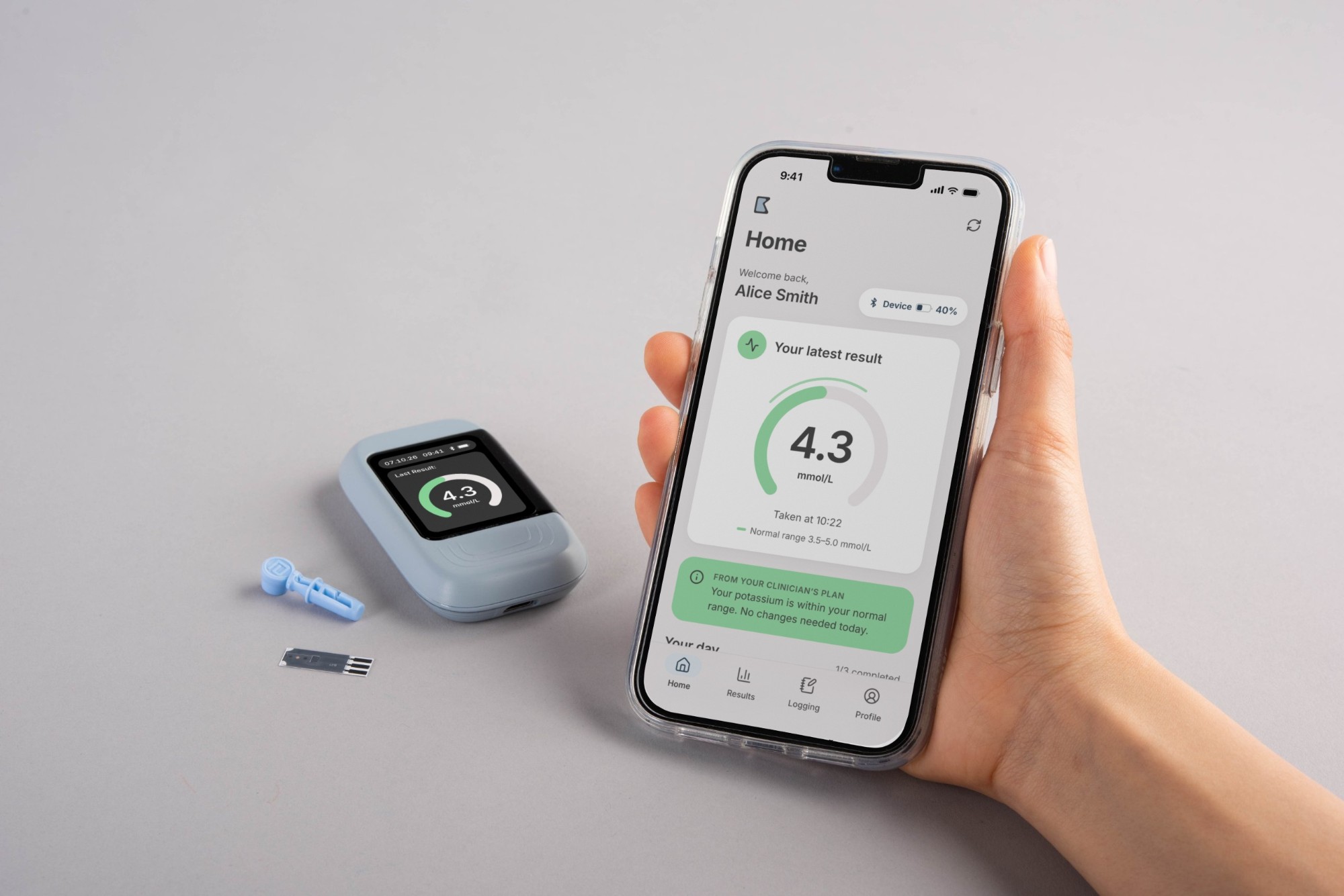
A handheld monitor with a test-strip reader. You insert a strip, apply a drop of blood, and your potassium reading appears on screen in under a minute.
It’s designed to be easy to use across ages and levels of dexterity, using automation and clear touch points to reduce the chance of mistakes.
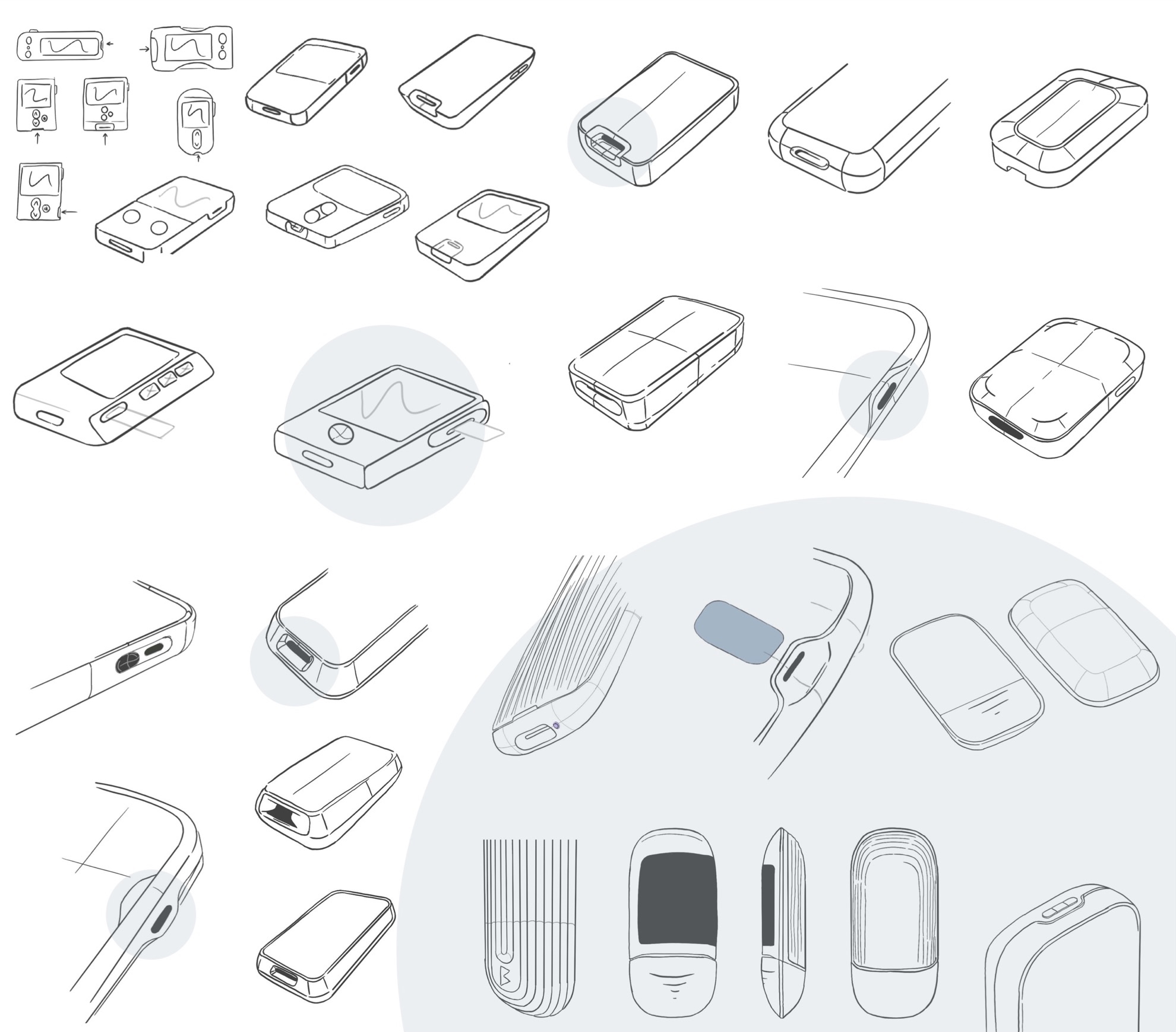
Sketching
I used rounds of physical and digital sketching to explore the form, the test-strip slot and how the screen sits in the body.
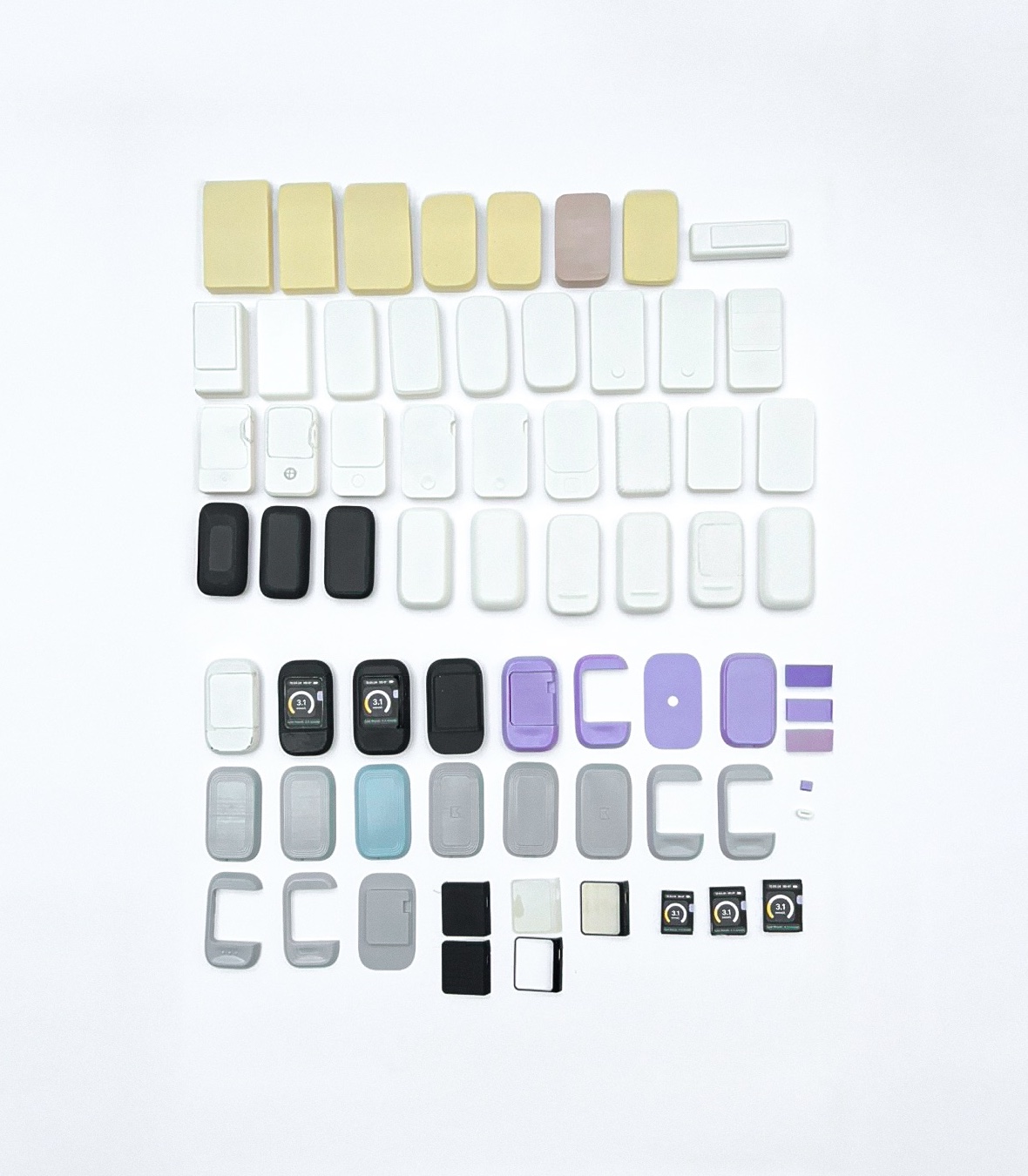
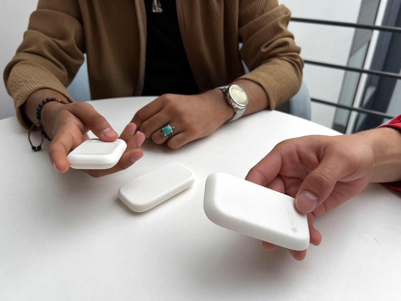
Prototyping and user testing
I made dozens of foam and 3D-printed models to test size, grip and where the strip, screen and button should sit, and put them in people’s hands to see how they held and used them.
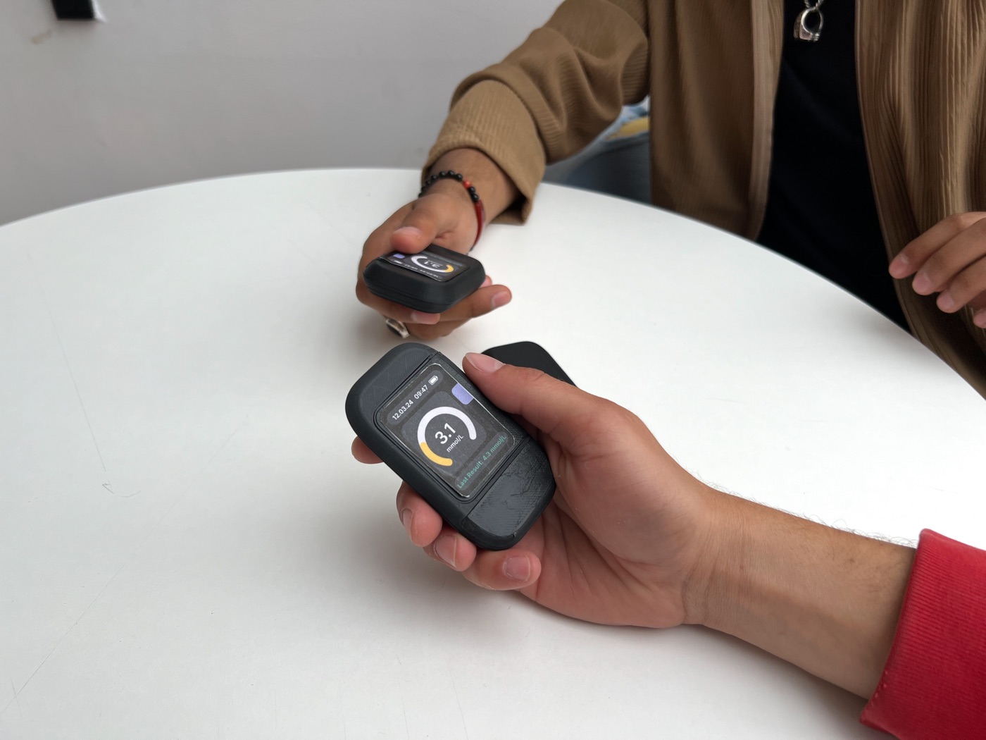
Final prototype
The device interface
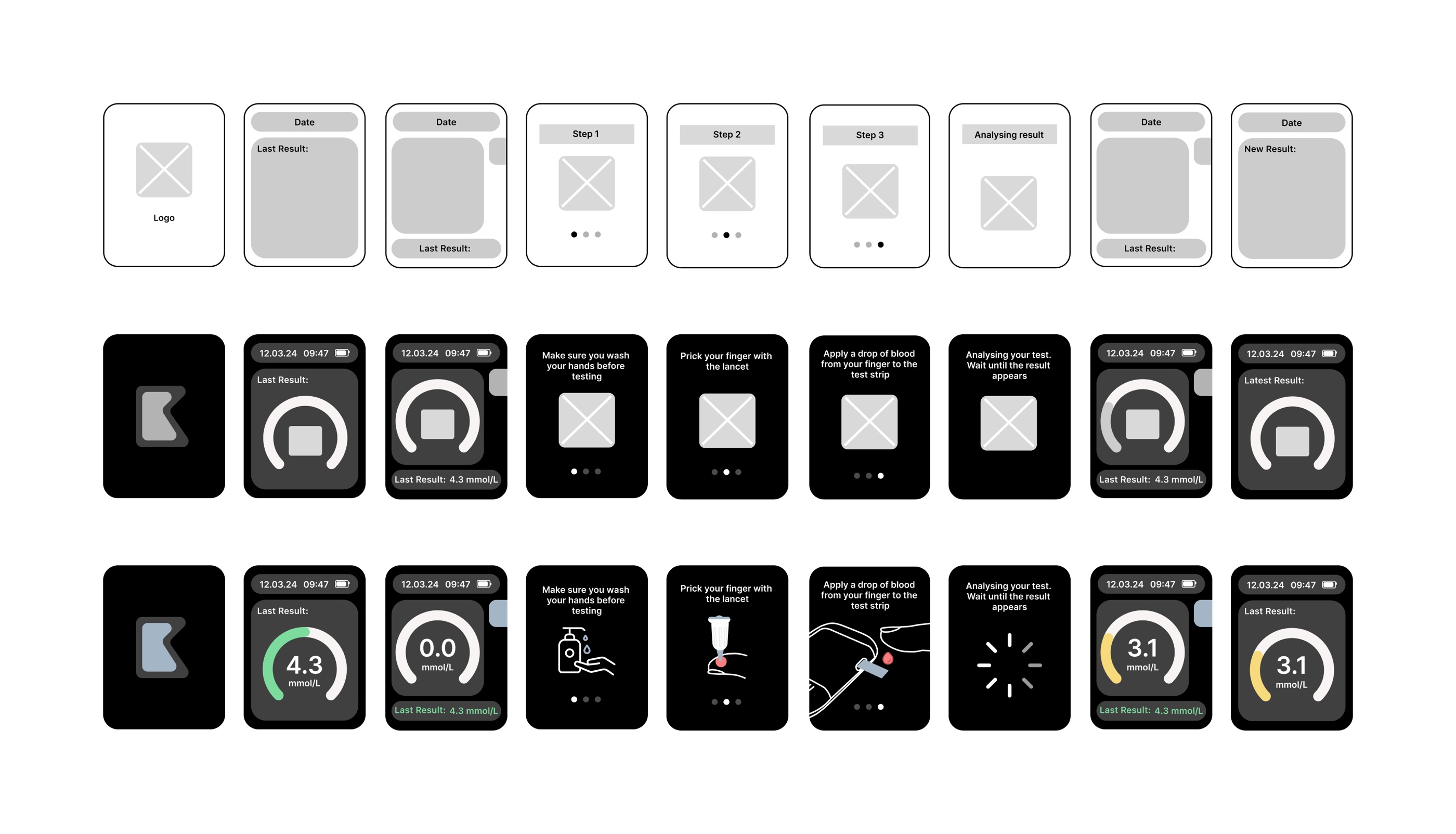
The monitor works on its own, without needing the app. Its screen guides people through setup and every test step by step.
As people get more familiar with the device, they can switch the instructions off in the app. The interface shares the device’s design language, so the object and the screen feel like one product.
When things go wrong
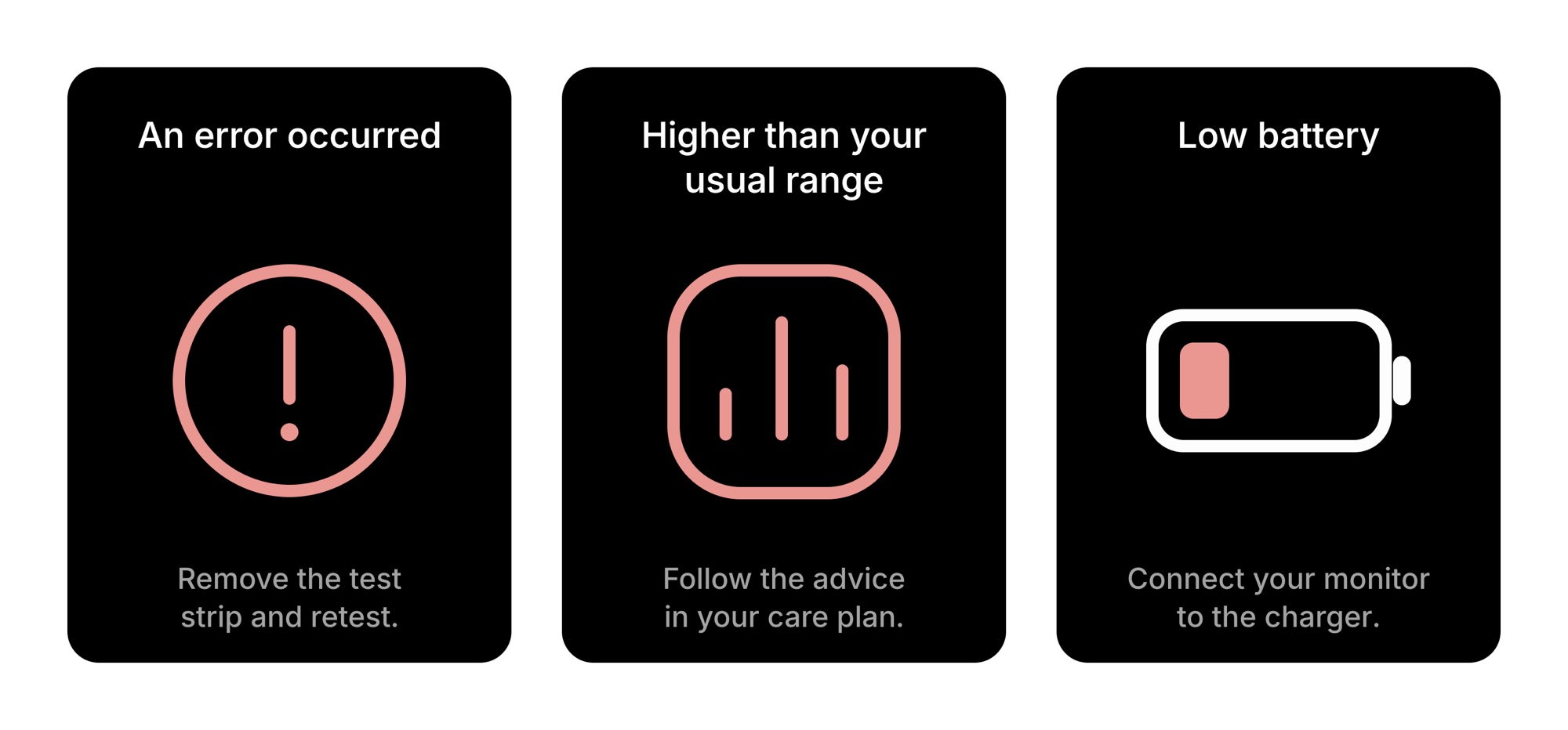
Every alert follows the same layout: what happened, a clear icon, and what to do next. An error asks people to remove the strip and retest, an out-of-range result points them to their care plan (or sends advice to the app when the monitor is paired), and a low battery prompts them to charge it.
The companion app
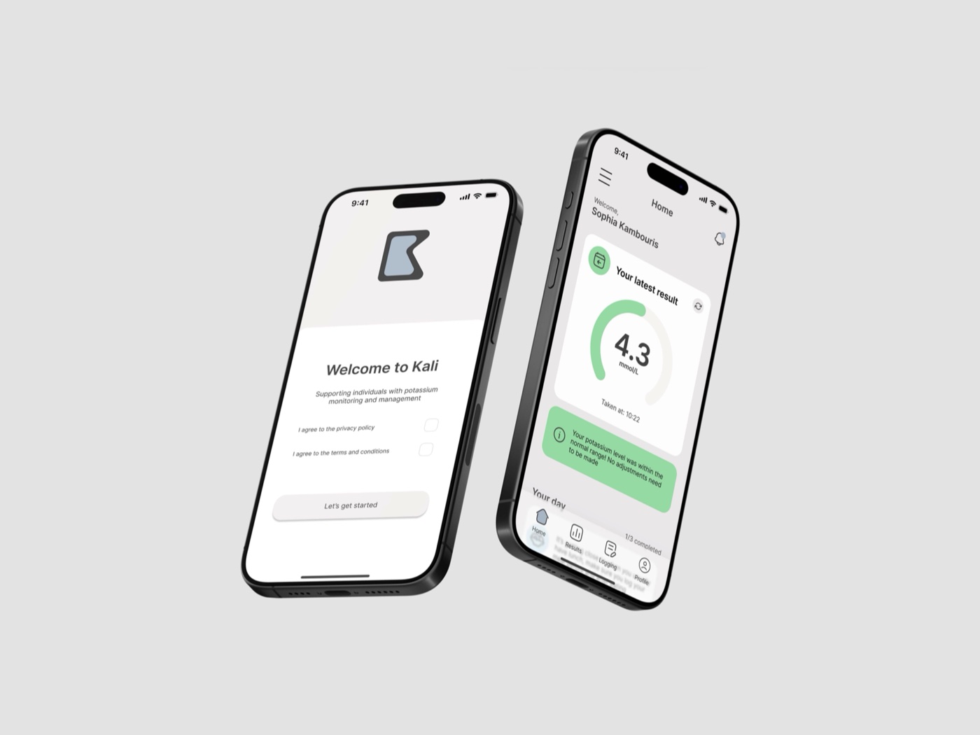
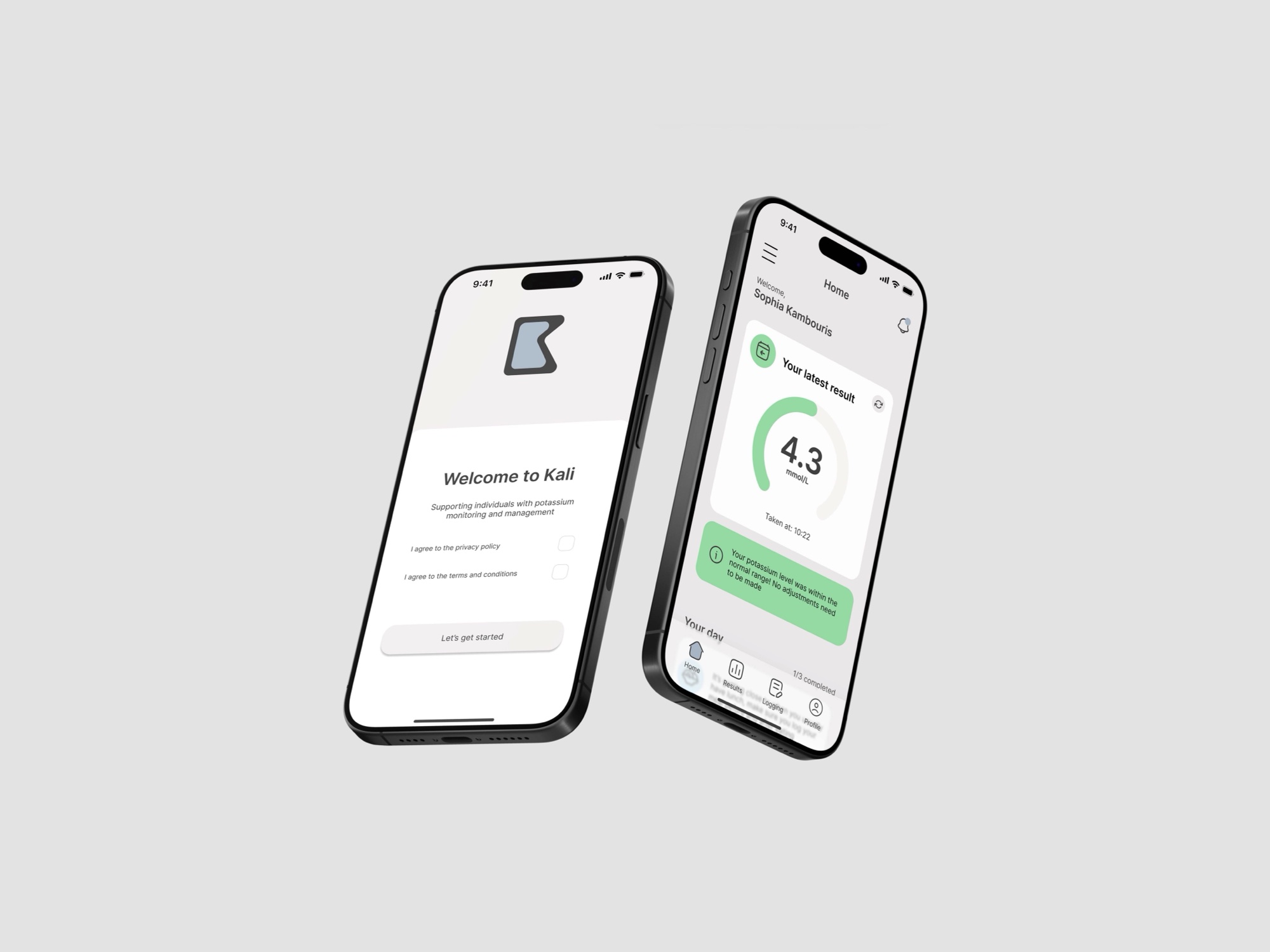
The app tracks results over days, weeks and months, carries tailored advice from clinicians, and sends reminders.
Patients can also log food, medication and symptoms, which all affect potassium levels. Clinicians told me an accurate log of diet alongside results would improve care, and that it would help explain why some patients’ levels vary so much.
Structure
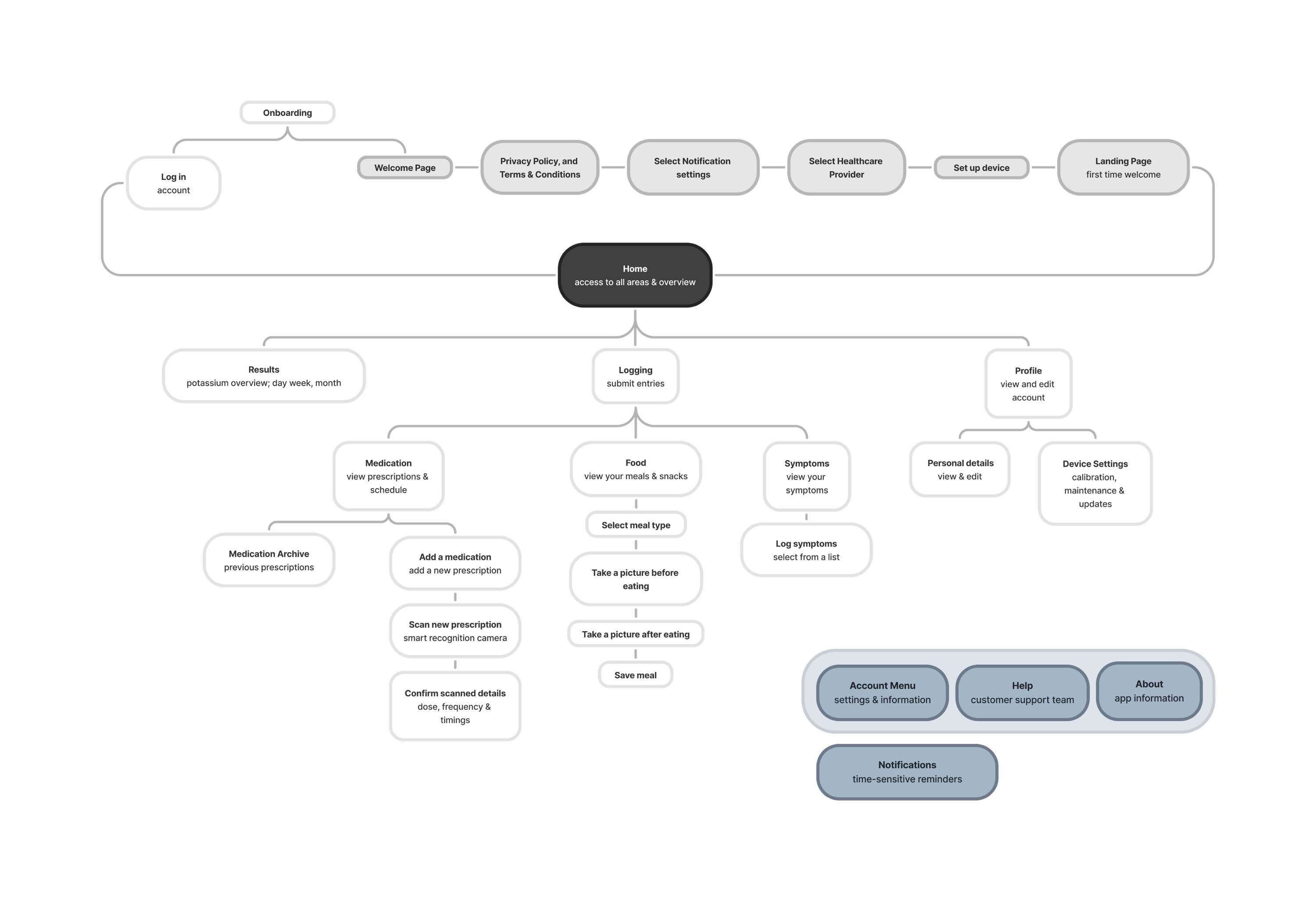
I mapped the app’s information architecture first: onboarding, then a home screen that leads to results, logging and profile.
From sketch to prototype
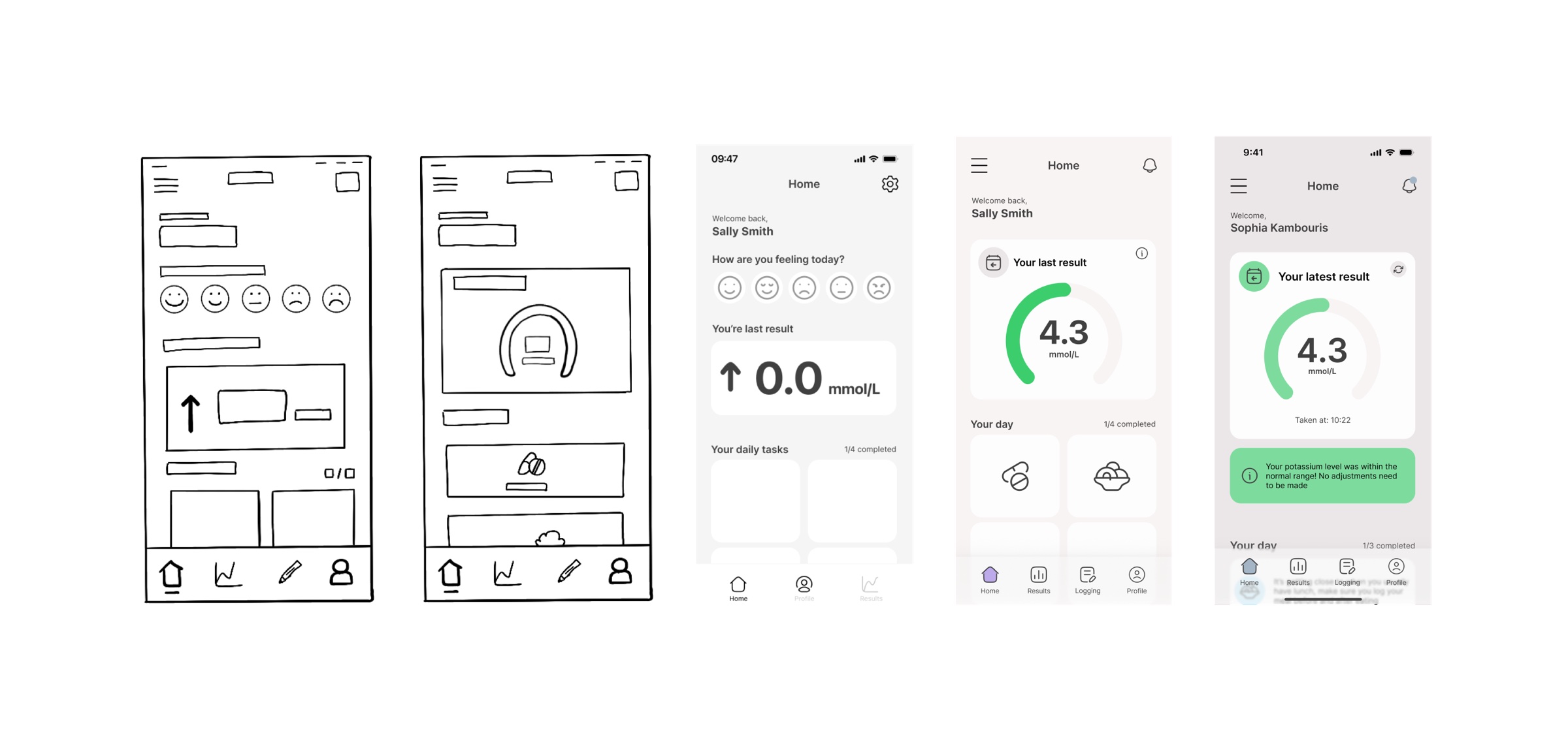
The screens moved from low-fidelity sketches to mid-fidelity wireframes, then to an interactive Figma prototype.
See Kali in action
Watch how the Kali device works on its own, then what the companion app adds to it.
Switch to ‘Try the app’ to explore it yourself. Everything you see uses made-up data.
Key design decisions
The choices that shaped Kali, and why.
- One pathway for every patient
- Four different routes into a test, from feeling unwell to dialysis, all lead to the same home test and the same clear next steps, so clinicians and patients follow one process.
- The monitor works on its own
- Every test can be done from the device alone, guided step by step on its screen. The app adds tracking, logging and clinician advice, but a test never depends on it.
- No modes to choose
- Inserting a strip starts the test automatically. With users across ages and levels of dexterity, fewer steps means fewer mistakes, and testers singled this out as something they liked.
- Guidance that steps back
- New users are walked through every step; experienced users can switch the instructions off in the app.
- A lighter colour, from testing
- On the dark model, people struggled to tell the test-strip slot from the charging port. A lighter body made both easier to find.
- A dedicated app for NHS systems
- Rather than building on an existing hospital patient app, I designed a dedicated app built to connect with NHS systems, a direction reinforced in discussions with Kalium Health.
Testing and outcome
I tested Kali with clinicians at Guy’s and St Thomas’, who confirmed it could reduce wait times and clinic workload.
I evaluated a physical model and the working Figma prototype with five people at Evelina London Children’s Hospital: two clinicians, two nurses and a patient’s parent. Each completed set tasks while thinking aloud, such as logging a meal, adding a medication and finding the device settings.
- Everyone found the device comfortable and light to hold; one compared its size and grip to a glucose meter.
- The screen text was easy to read, even for people who usually wear glasses.
- People liked that the device detects a test strip automatically, with no mode to select.
- Most moved through the app with few errors. Two found the device settings hard to locate and suggested surfacing them on the home screen.
- Half found the test-strip slot straight away; a lighter-coloured model made the ports clearer.
“It’s gonna be a lot more manageable for people. Fantastic. A lot less stress.”
Kali met every point of the product design specification except a dashboard for clinicians, which was out of scope for this project.
Recognition
- New Designers of the Year Award WinnerBusiness Design Centre · 2024
- DCA Award Runner UpDCA Design · 2024
- PriestmanGoode Award Runner UpPriestmanGoode · 2024
“Very compelling story and journey.”
Reflection and next steps
Medical products are usually developed by multidisciplinary teams over years. Doing the research, industrial design, interface, app and pathway work alone, within a university timeline and around ethics approval, meant choosing carefully where to go deep.
Next, I’d design the clinician dashboard, run a full clinical study with a larger group of patients, add a case to carry the monitor, lancets, strips and charger, and work towards medical device safety standards.